E W CARPENTRY
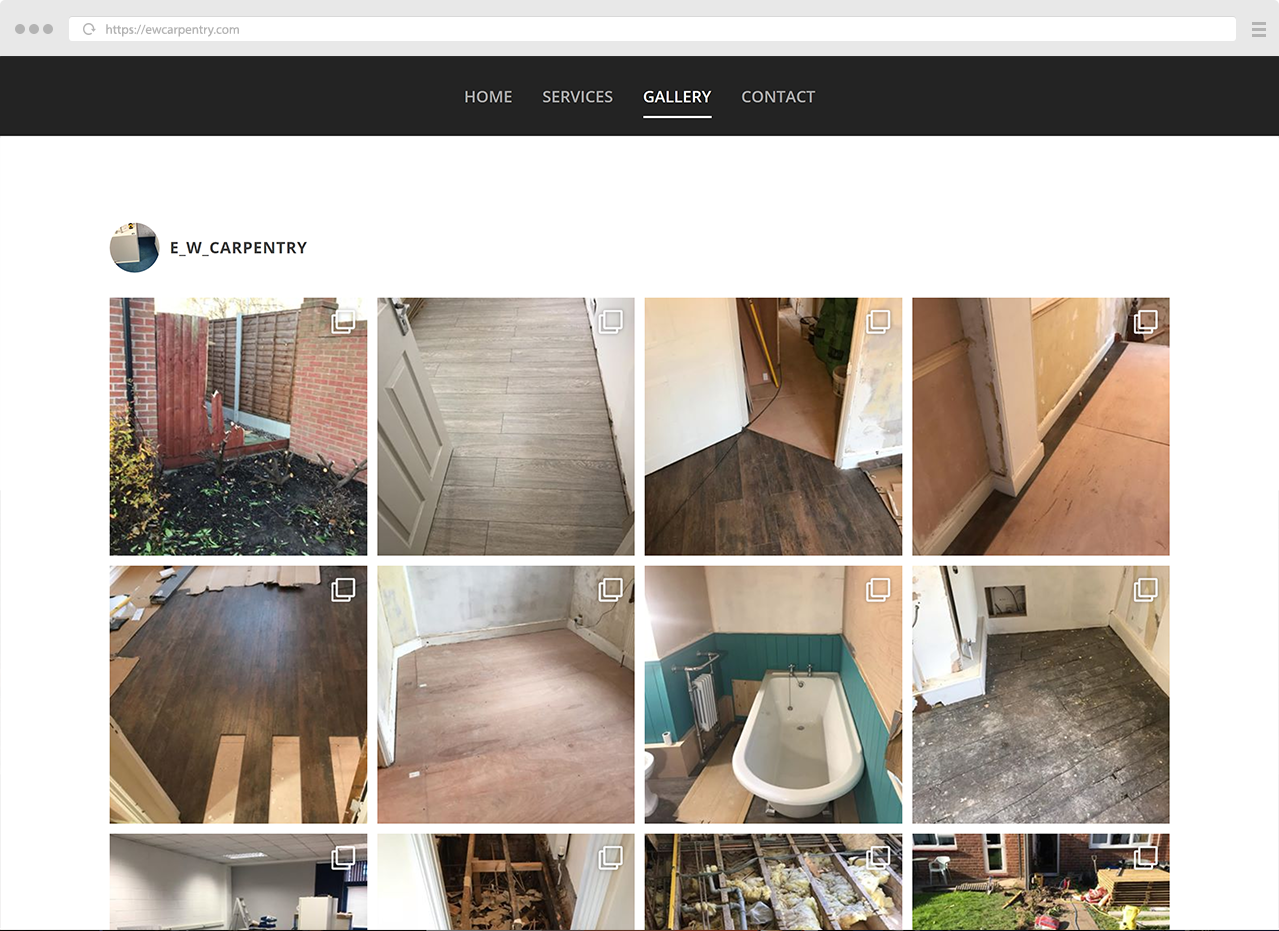
- Live instagram gallery
- Contact forms
- Scrapbook looking homepage design


About the project
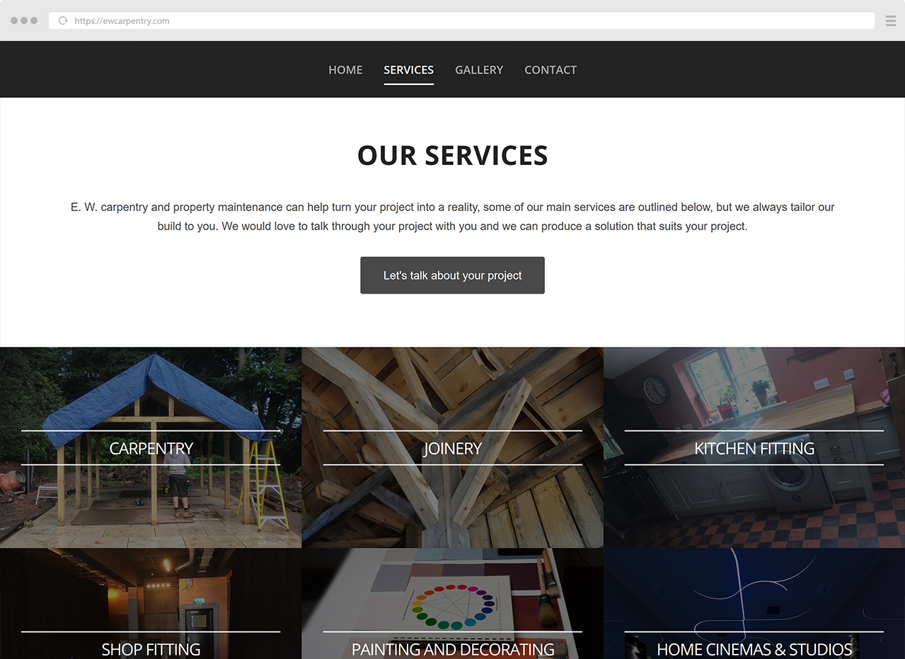
This promotional site for E W Carpentry was designed to be professional, clear and minimalist with big images, the homepage was designed to look like a project scrapbook, we added a bend and shadow to the images to make them appear 3D on the page and lift up from the background. Brass Comet also designed the logo for this site from the clients guidelines.


