
Launching a website: www.biglittlethings.co.uk
Written by Rich Steedman
Some of the key features of the new site are as follows:
- E-commerce
- Responsive across devices
- Blog
- Mailing list sign up
- Contact forms
- Interactive maps
- Responsive tables for events.
After recently launching our latest e-commerce site this blog post looks at how the site was mobile optimised and also some of the design features included in both the desktop and mobile versions of the site.
The main goal from the initial briefing was clear; to take the current site and to mobile optimise it as today over half of all web traffic is on a mobile device so having the site easy and clear to use for multiple devices was the key aspect for the new site.
Here is a before and after from old site to new site as it would be viewed on a mobile device
As you can see with the previous version of the site the menus are small and hard to navigate on a phone screen, some of the text is unreadable as it is that small and the images appear very small on screen. This carried on throughout the site meaning that the process of purchasing items or finding out more information about events was difficult or almost impossible which impacts negatively on sales, event attendance and the overall image of the business.
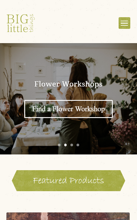
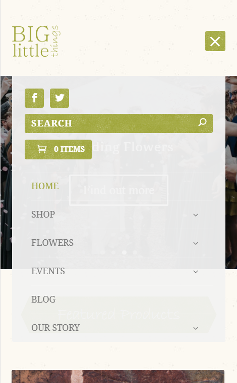
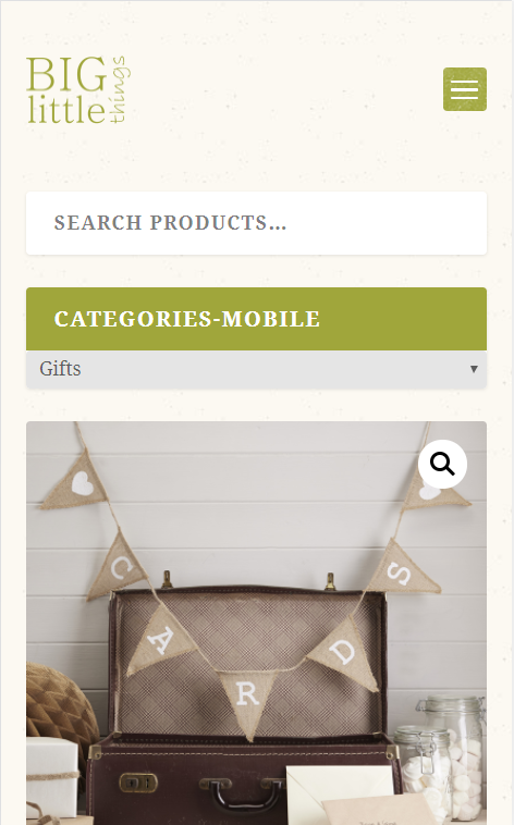
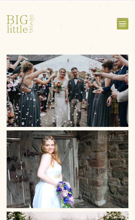
In the new website design we addressed these issues by using a hamburger menu which is a common menu design when it comes to mobile. This allows users to expand out the menu options which are a lot easier to read and navigate, within this menu it also shows the basket of the shop meaning customers can access their basket quicker and check out faster and easier, an example of how this menu displays can be seen below. The images and text were resized from desktop making them easy to view and read.
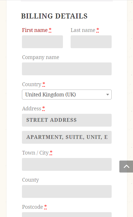
The mobile friendliness of the site continues throughout the pages and elements as seen below
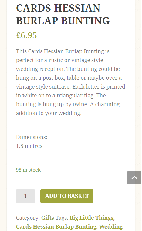
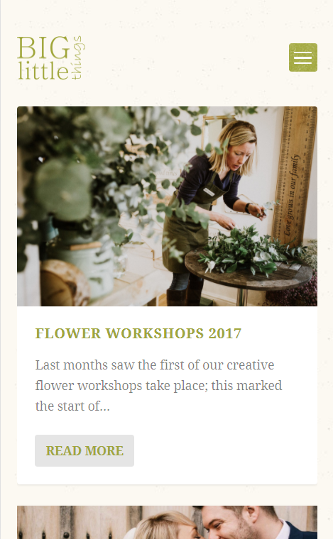
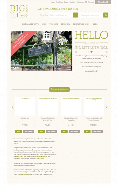
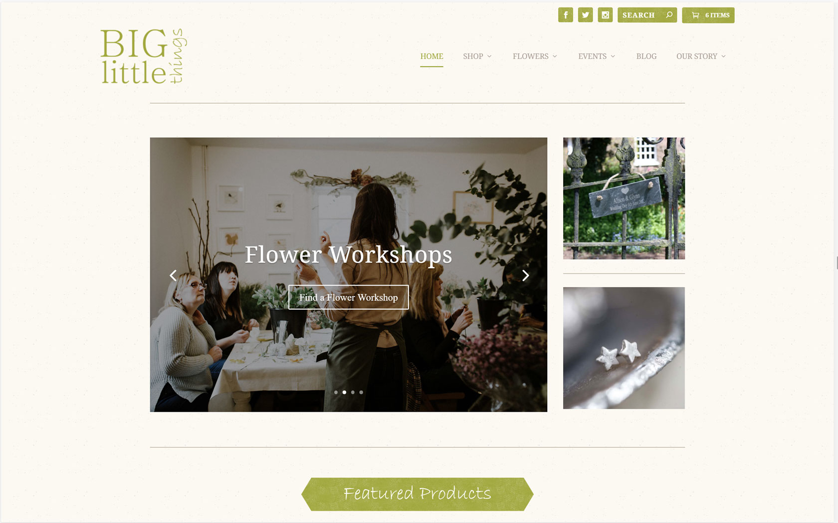
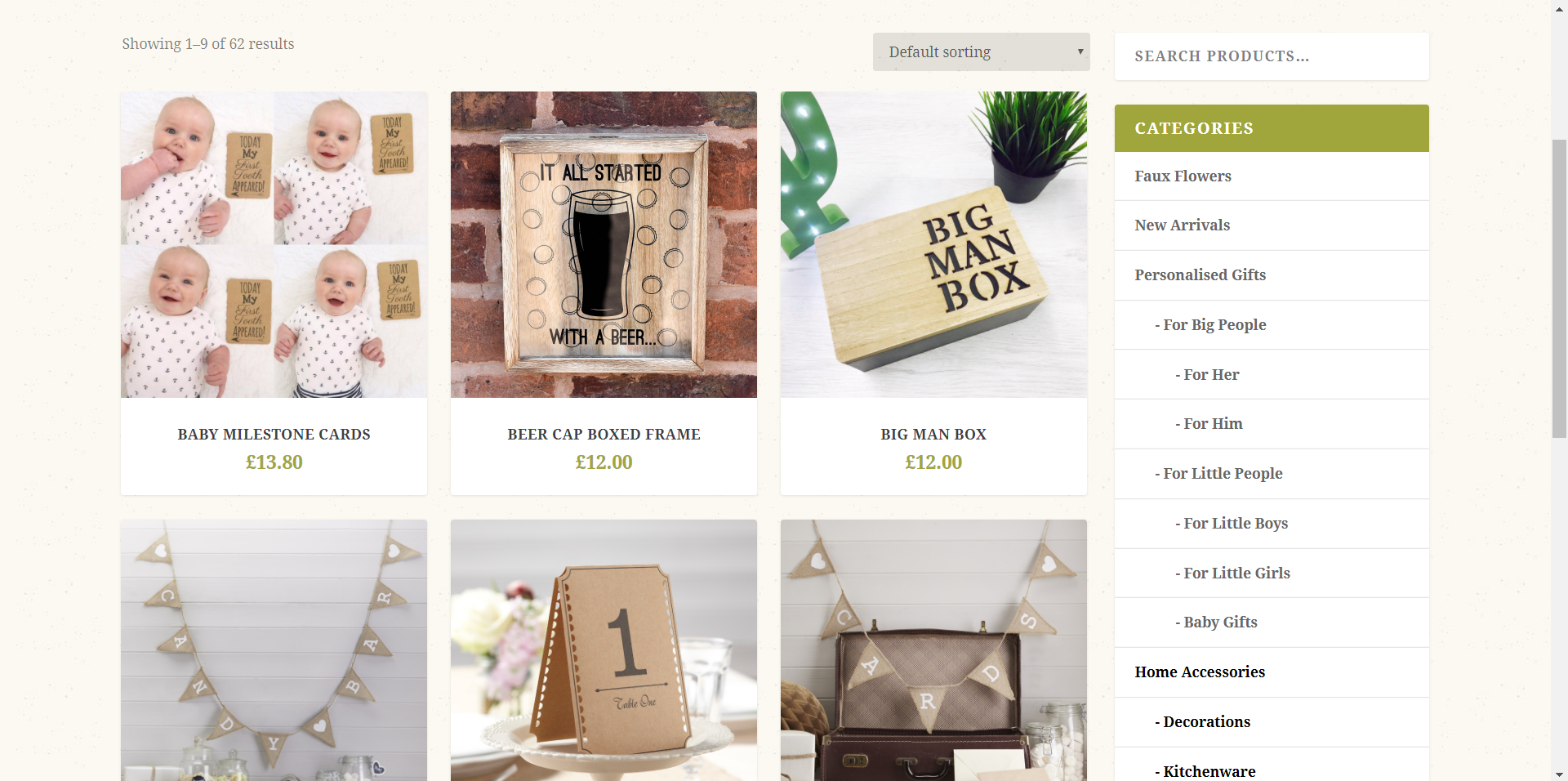
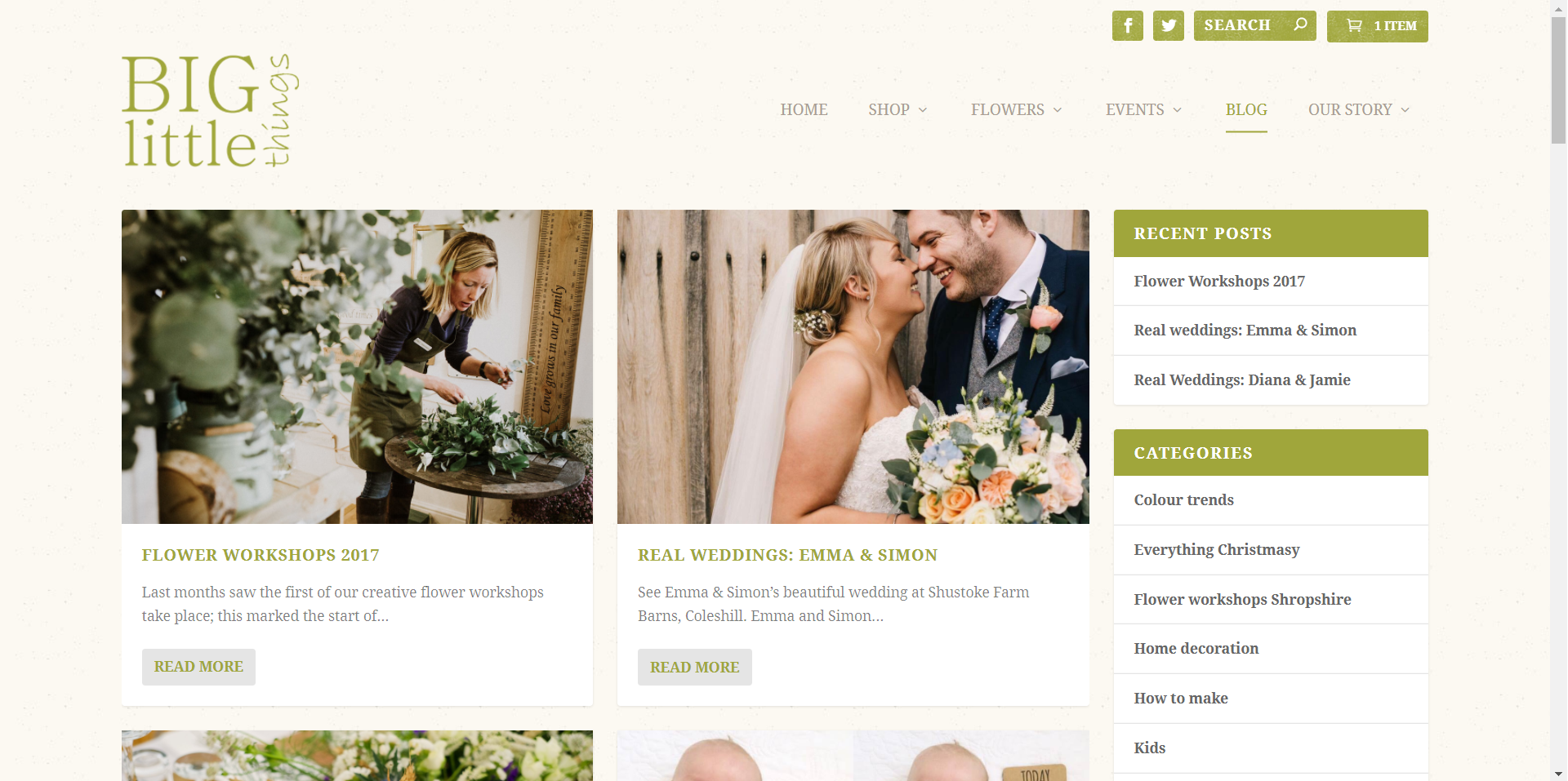
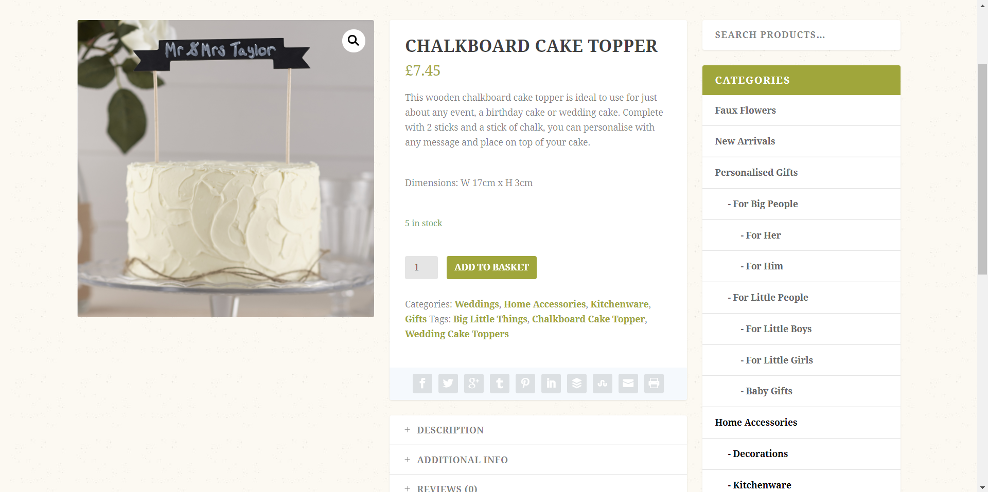
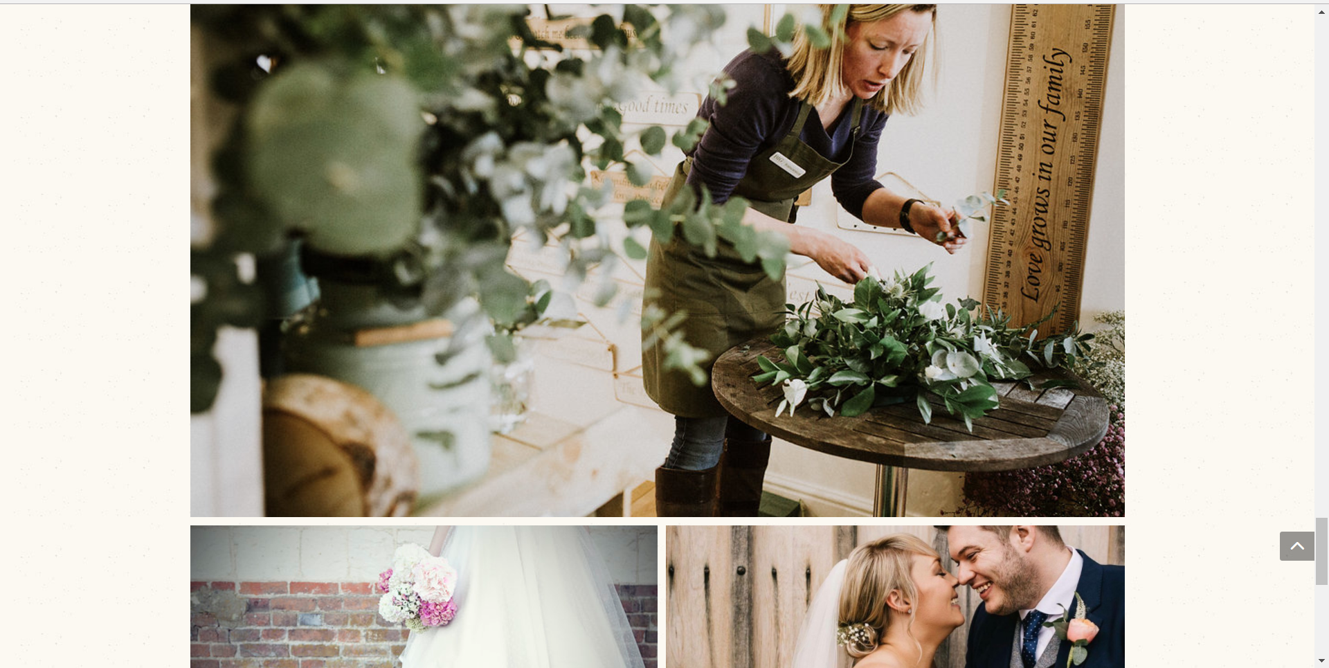
We rebuilt the desktop version of the site, as well as switching the existing shop to a different e-commerce platform. This portion involved lots of data export and import taking products and blog posts from the previous site and importing them to the new site with updated styles. The new site boasts a modern and clean look with not much clutter or busy sections. The shop, blog posts and galleries have been modernised using tiles that fit together uniquely rather than having a regimented set size which can crop or distort images.
Below are some images of the desktop view of the new site.
As with all of our sites we encourage any feedback, so please don’t hesitate to get in touch, or if you have a project you wished to discuss with us don’t hesitate.
Thanks for reading
Rich
0 Comments